


Feminism | Public art | Visual Arts | Yale University Art Gallery | Arts, Culture & Community | Graphic Design
 Sheila Levrant de Bretteville: Community, Activism, and Design runs through June 23 at the Yale University Art Gallery. Photos Kapp Singer.
In 2004, Sheila Levrant de Bretteville installed a mosaic frieze encircling the lobby of James Hillhouse High School. It’s still there—150 green, purple and gold ceramic tiles, arrayed in orthogonal bands inspired by Kente cloth. The gold tiles are printed with quotes from former Hillhouse students that de Bretteville gathered from school magazines, newspapers, and personal interviews over the course of two years. Each tells just a snippet of a story; altogether they form a montage of life at the school since its founding in 1859.
“Public art is unique in its ability to be integral to a space while transforming it to reflect its population,” de Bretteville wrote in the project proposal.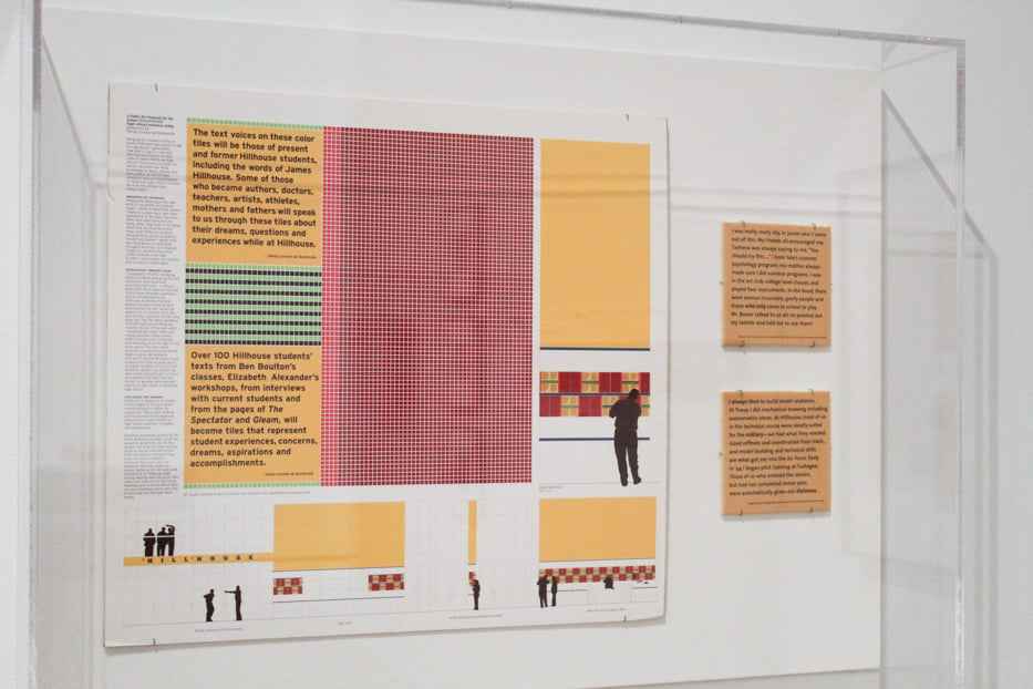 Proposal for the Hillhouse mosaic frieze.
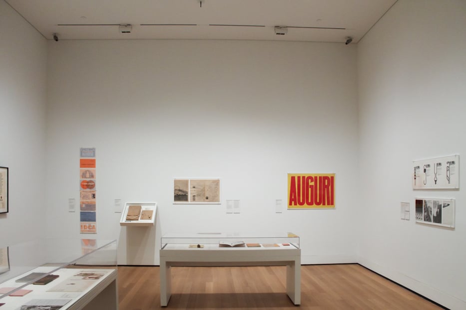
That proposal and two gold sample tiles are currently on view at the Yale University Art Gallery as part of Sheila Levrant de Bretteville: Community, Activism, and Design. The show, which runs through June 23 on the fourth floor of the gallery, is the graphic designer’s first solo retrospective. Curators Brooke Hodge and John Stewart Gordon, with assistance from Pamela Hovland, gathered materials from across de Bretteville’s 50-plus year corpus, focusing particularly on her public and activist art works and her contributions to feminist design. At its core, the show emphasizes that activist art is not—and perhaps cannot be—a solo pursuit.
De Bretteville, born in 1940, earned her MFA from the Yale School of Art in 1964. The exhibit begins in the years directly after this, with promotional materials that she designed for Yale University Press and—while living in Milan for a short stint—the Italian manufacturer Olivetti.
Her early body of work is pared-down and elegant. Simple sans serifs and systematic color palettes capture the influence of the Bauhaus style and Josef Albers in particular on de Bretteville. 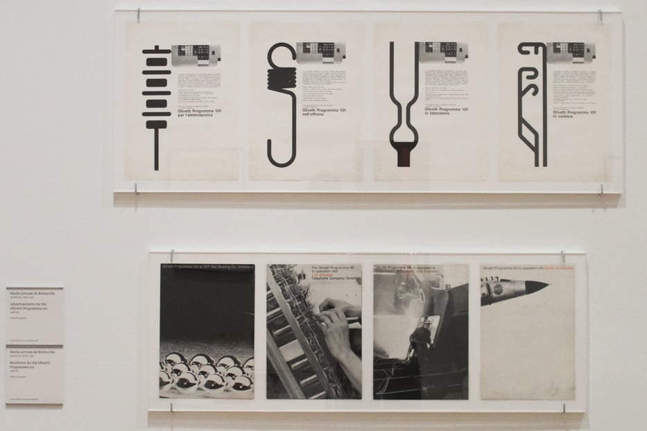 Advertisements for Olivetti.
In the years following these initial corporate and editorial commissions, de Bretteville’s work became much more overtly political. In the early 1970s, after moving to Los Angeles, she began collaborating with artists Miriam Schapiro and Judy Chicago, and the art historian Arlene Raven, to build arts instruction programs, exhibits, and studio and meeting spaces specifically for women. De Bretteville first brought these programs to CalArts, where she was teaching at the time. After that, in 1973, she helped establish the Woman’s Building, a nonprofit feminist arts organization that hosted public art and design classes.
The show relays this history through printed materials de Bretteville created for these institutions, including posters that advertised programming and publications featuring a wide range of feminist writing.
Her piece Pink, from 1974, captures well how de Bretteville’s efforts to build feminist art communities informed her design work. The 30-inch square poster is divided into a grid, and in each box is an image or block of text reflecting on the meaning of the color pink. To make the poster, De Bretteville asked a number of women of all ages to reflect on the color before piecing all the fragments together into a patchwork.
“Scratch pink and it bleeds,” reads one box. “Pink is the color my mother wished for me, thinking it sweet, thinking it pure, thinking it all things not violent or cruel,” another goes. A third simply features a collection of shapes, an abstract pile of what look to be rose petals.
In a fourth there is a photograph of a young girl blowing out the candles on cake. “Little girls are pink,” reads the cursive caption. (De Bretteville initially made the piece as an installation at the Whitney Museum of American Art and later printed the poster on view from a photograph.)
Pink lives on across the gallery, where curators reproduced the format of the project and viewers can add their own reflections to a large paper grid. “Loveniss! Kindniss! Being Your Self,” wrote Mia, age 7.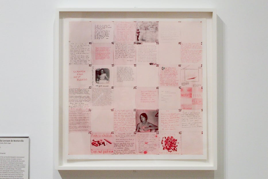
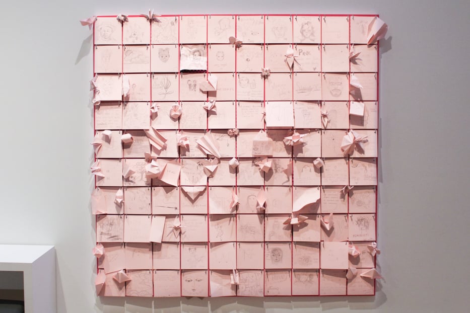 Top: Pink. Bottom: The gallery's own interactive version of the original piece, dubbed re:Pink.
Also present throughout the show is de Bretteville’s embrace of play and kitsch. Her work, while serious, doesn’t take itself too seriously.
Take, for example, Your Vagina Smells Fine Now Naturally, a roll of small, round pink stickers with the titular text printed in a black sans serif. The stickers were conceived as a culture jamming tactic, intended to be stuck on feminine hygiene products in drugstores. Displayed in the gallery beside the roll is a box for a disposable douche advertising a “scent of country flowers,” which de Bretteville’s lo-fi decal humorously undermines.
De Bretteville’s iconic Eyebolt Necklace design—a nut threaded onto looped metal fastener forming the circle-and-cross symbol for women—similarly captures how the artist wields her politics through simple forms and cheap materials. De Bretteville continues to give out the necklace as gifts, and once sold them to support her Feminist Studio Workshop art program. As the wall text notes, “she encourages anyone to use the design.”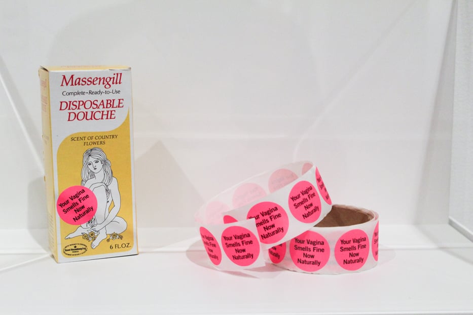
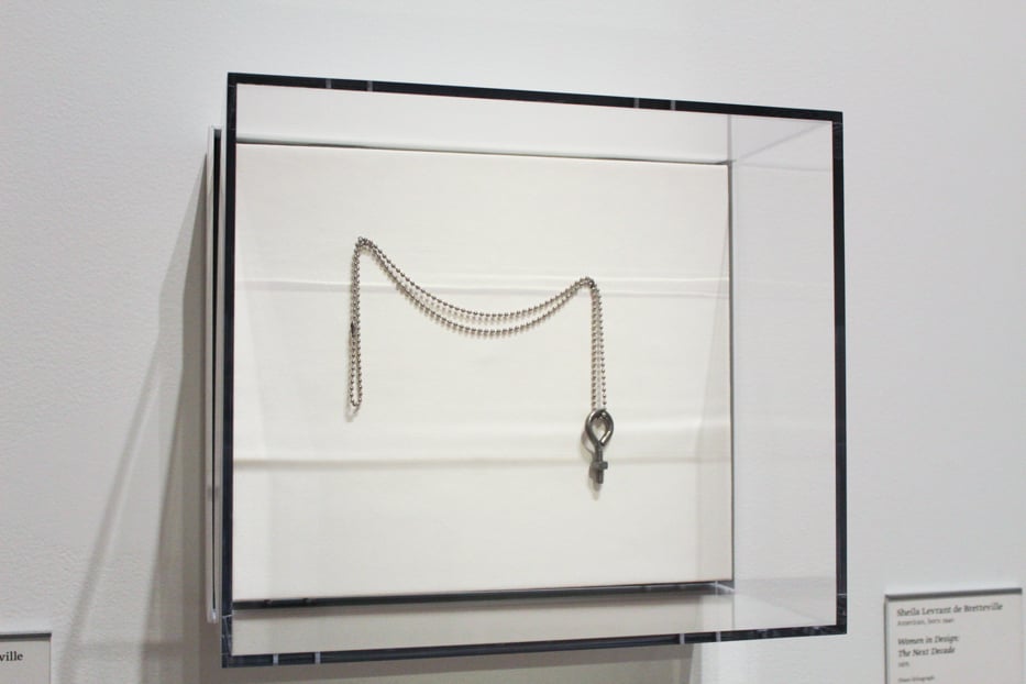 Top: Your Vagina Smells Fine Naturally. Bottom: Eyebolt Necklace.
In many ways, the necklace or the stickers are the polar opposite of her large public art programs. They are small, simple, cheap, and tongue-in-cheek—what one might call low design. But they also function in much the same way: they are meant to be experienced by everyone.