


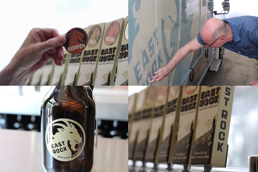
| George Corsillo, one half of the Design Monsters team, with the brewery's new tap handles. Lucy Gellman Photos. |
The taps are polished. Large, vintage-looking posters wink out from the walls. Friendly Billy goats, one eye cracked open, watch as new visitors pass by. A delivery truck sits in the loading dock, three huge vinyl beer bottles emblazoned on its back. East Rock Brewing Company is almost set to open—thanks in part to a community of New Haven artists and architects who rallied around its design.
It’s the latest chapter for the brewery, the Nicoll Street brainchild of brothers Tim and Shaun Wilson that has been over two years in the making. After pitching the neighborhood, working with the city’s Board of Zoning Appeals, revitalizing the building, and spending months drafting and redrafting designs, Tim Wilson said the spot is set to open this month, perhaps as soon as the weekend of the 15th. He is still waiting on a certificate of occupancy for the parking garage at 235 Nicoll St., part of which sits below the brew hall.
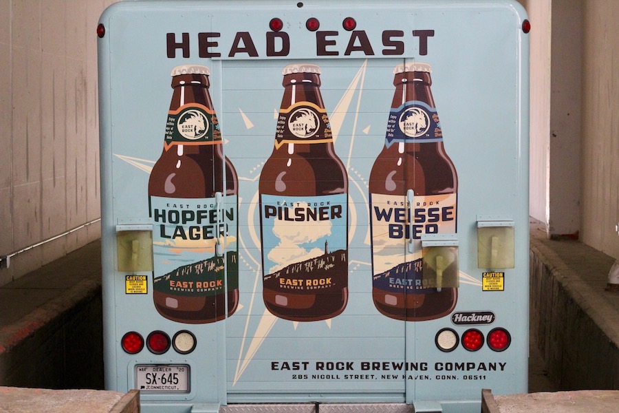
The brewery comprises a 100-seat beer hall (there is overflow room for 50 standing occupants), tasting room, and sprawling brew area, where glinting, industrial kettles and temperature equipment are visible at the back. Beer barrels are kept chilled in the area, in a 600 square foot walk-in freezer. Already, Wilson has been distributing the brewery’s signature Pilsner, Weisse Bier, and Hopfen Lager to several stores in the area. He said there will be 18 seasonal brands overall.
What has made the brewery such a New Haven spot already, Wilson said in an interview Wednesday afternoon, is the team that he hired to work on the space. After reading a story in the New Haven Independent in June of 2016, architect Craig Newick reached out to Wilson, eager to know more about the project. Newick is head of Newick Architects and a Goatville neighbor who works in the nearby Marlin Works building on Willow Street. He’s lived nearby in East Rock with his wife, the artist Linda Lindroth, for over 30 years. He knew the building from its past life—an industrial hub, home to a wire and cable business for seven decades.
“Even though I’m a modernist guy who believes in the future, I have this incredible respect for historical works,” he said in an interview Thursday morning. “You really wish in the process of taking cities apart, they [city governments and developers] would just take the bad stuff out.”
“As a maker of space, you’re looking at this extraordinary construction and hoping that you don’t mess up,” he added.
Newick found that the building had been constructed in stages, not uncommon for factory buildings from the twentieth century. Its oldest sections, where mActivity Fitness Center now stands, date back to the nineteenth century. In the part of the property where the brewery was planned, the building dated back to the 1940s. Thanks to its past life, a portion of it already had a sprawling space with huge, sawtooth skylights, the original way of lighting the dark factory floor.

| Through a wall composed of Superclear glass—a glass with low iron content, making it incredibly clear—patrons get a behind-the-scenes look at brewing operations. |
“It’s amazing back there,” Newick said. “On the dimmest day, you don’t need to turn the lights on.”
He and Wilson looked over the original, 28,000 square foot plan, discussing how to separate out the three different areas where people would congregate. Together, they devised a sort of sudsy Narnia, in which the wardrobe is transparent and warm, and smells of malt and wood. On one side of a clear glass wall, patrons have the tasting area and brew hall, separated from extra seating by a wall. They factored in counters: one where patrons can order beer, and another with growlers waiting to be filled, and taken home.
On the other, accessible through a large pivot door, the brew area unfolds. Closest to the glass—which is also over the parking garage—there’s bottling equipment ready for new brews, already in use for beer that’s been distributed to shops. Further back, huge beer kettles sit on a part of the old factory floor that is on soil, and then reinforced.
The brewery still needed designers, Newick and Wilson realized. Newick suggested Design Monsters, the internationally recognized Westville duo George Corsillo and Susan McCaslin. He said he could see Corsillo’s style of illustration working particularly well for the space.
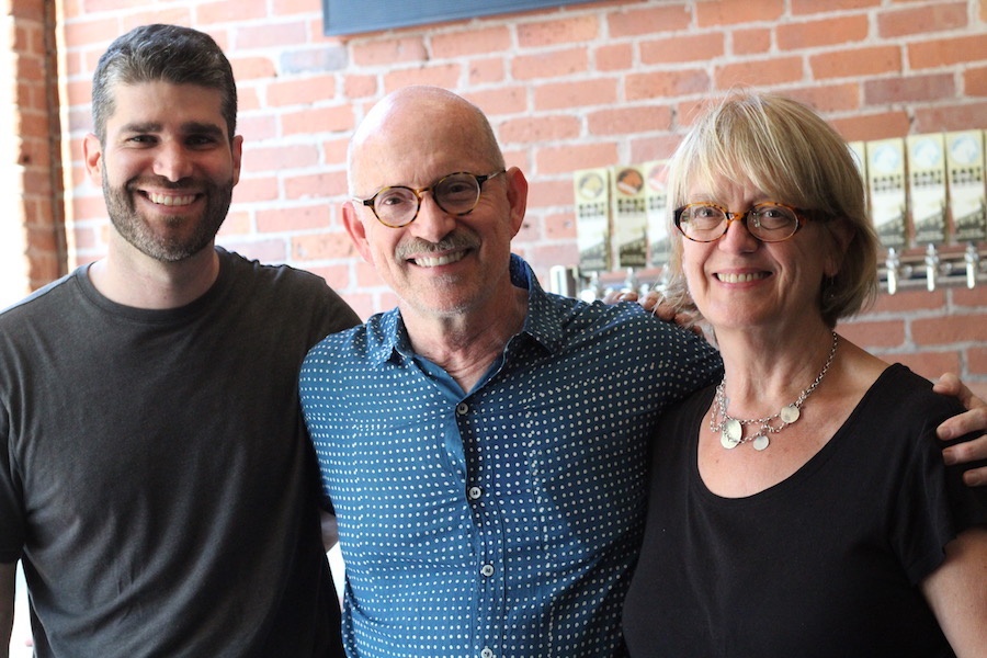
| Tim Wilson, with George Corsillo and Susan McCaslin. |
After an initial meeting at Manjares last year (“there were many blueberry scones” devoured before the project was over, Wilson said), Design Monsters began working through designs, with McCaslin taking on a sleek new website and Corsillo and Wilson trading drafts. They tossed ideas back and forth: Would labels include a goat for the Goatville neighborhood in which the brewery is located? What about a reference to East Rock? What colors would look best in the space? What about on packaging?
Early on, Wilson explained that he wanted something that would celebrate “the German-ness of the beer,” a kind of elegance and simplicity that mirrors traditional German brewing practices. For him, that means in keeping the German Reinheitsgebot, a centuries-old beer purity law that is still enforced in Germany today. Several years ago, he spent time training at Doemens Academy in Munich, and still gravitates toward those brewing processes, which limit the number of ingredients brewers may use to still classify a fermented beverage as “beer.”
Between coffee and scones, the three took a trip to Amity Wine & Liquor, inspecting craft beer labels that they liked, and ruling out several that they didn’t. None of them wanted images that were too flashy, where the design on the beer overpowered the very thing it was advertising.
“We thought, ‘Oh my god, you can’t see the forest through the trees,’” recalled Corsillo. With Wilson, he gravitated toward cleaner designs, consistent across packaging for a given brand. As a book jacket designer, Corsillo said he knew he wanted big, punchy type that people would see from the side of the box, which he likened to the spine of a book. And it had to be consistent—the idea of wildly different designs under the same label didn't sit well with anyone on the team.
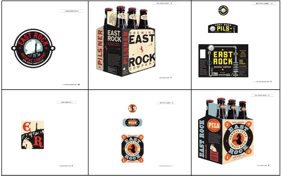
| Some of Design Monsters' preliminary designs, courtesy Design Monsters. |
So they started thinking about goats. As Wilson sent Corsillo several logos that he liked, Corsillo scoured books, magazines, and the web for images of goats, zeroing in on designs of “medieval goat head” that held his attention. It was perfect for a double entendre: in German, Bock is a type of dark beer and also word for Billy goat, used in multiple idiomatic expressions. They started in on labels. But something felt like it was still missing.
“Then it became about the hill,” Corsillo said, referring to East Rock. The team imagined East Rock facing out on the labels, with the historic Soldiers and Sailors monument featured prominently against white clouds and a sea-foam colored sky. And then it clicked: go vintage. On vacation with his wife in Yosemite, Wilson had seen several posters celebrating the National Park Service’s centennial, all rendered in a style reminiscent of Works Progress Administration (WPA) era artwork.
“I hadn’t thought about it as branding for the brewery, but I kind of loved it,” he said.
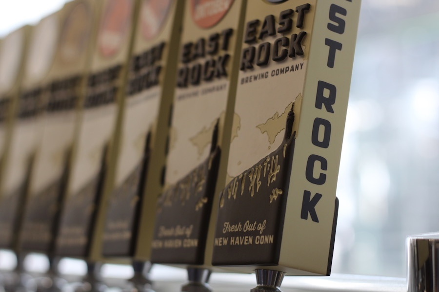
As label and poster designs unfolded, Design Monsters also took on the tap handles, which have a raised impression of East Rock and interchangeable magnets that correspond with the brand of beer. On a standing wall, Corsillo painted a mural with the brewery’s logo, clouds rolling across the sky as the sunlit monument glows proudly below. Then came goat-emblazoned growlers, more bright posters (there is one for each type of signature bear, each with the clouds and goats in slightly different formation), and brewery t-shirts. After learning from Wilson that "it's all about the head," Corsillo introduced the motto "head East" into the brewery's wheelhouse.
But that work, with McCaslin's now-live website, isn’t the only local touch. Alongside the beer, Wilson is bringing in pretzels from Whole G. The brown-and-cream boxes for his six packs, for which the team had a special paint color mixed, are printed at Keystone Paper and Box. Printed materials come from Docuprint, and t-shirts at Campus Customs. Whatever Wilson could keep in or around New Haven, he did.
“I wanted to work with local folks,” he said, passing by a counter of empty growlers on an informal tour of the space. “We’re buying malt from Germany. So certainly, any business partners that we can work with locally, we will.”
For him, it’s personal. Growing up just miles away in Orange, the Wilson brothers visited the city frequently, diving into its nooks and crannies as they discovered the culture, food, and nightlife that it had to offer. He was saddened with New Haven’s last craft breweries closed within a year of each other, in 1997 and 1998. He said he wanted everyone to love Connecticut as much as he did.
But he had a rude awakening in Boston, where he worked as a brewer for Jack’s Abby in Framingham, Mass. for several years before moving back to Connecticut. The work was good—Wilson had gone to school in Germany with brewery co-owner Jack Hendler, and liked what the brewery was doing. But Boston felt overwhelming. And a colleague of his often joked that his home state was not Connecticut but “NewYorkAChussets,” a mash-up of the states that Connecticut is sometimes lauded for its proximity to.
“That always left a chip on my shoulder,” he said. “I really didn’t feel like the city got the love it deserved. It’s the right blend of being a small city of a manageable size."
"If there was any city that deserved a brewery," he added, "it was New Haven."