

Painting | Arts & Culture | Visual Arts | Yale Center For British Art | University of New Haven

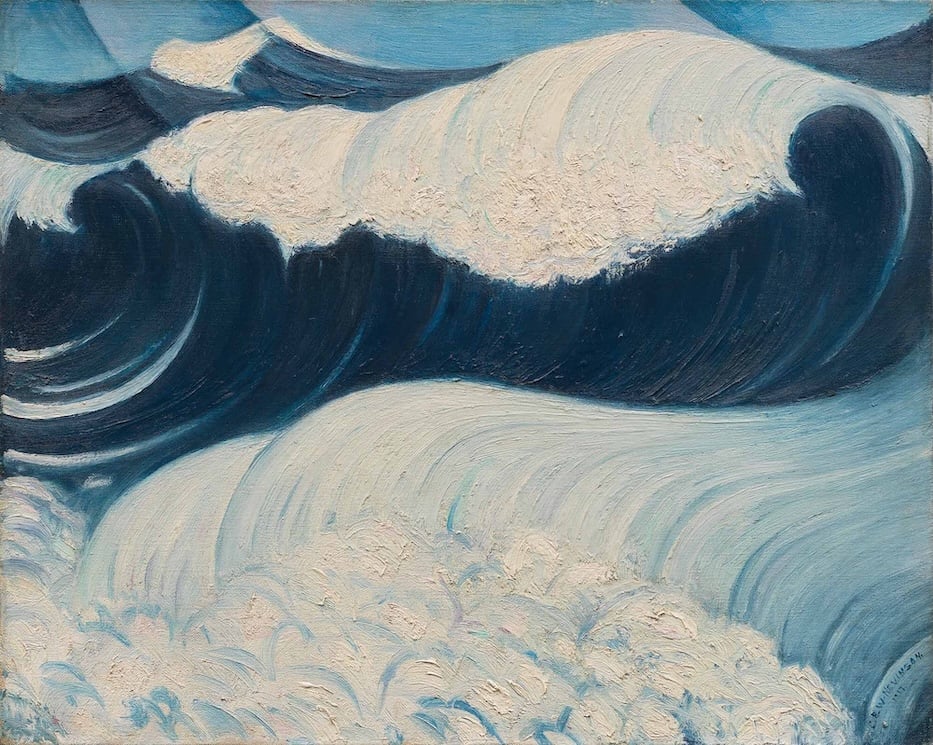
Christopher Richard Wynne Nevinson, The Wave, 1917. Yale Center for British Art, Paul Mellon Fund.
The following comes from the Arts Paper's collaboration with students in ARHS-3375-01W, Art Theory and Criticism at the University of New Haven, where they are working with artist, writer, art historian and educator Jacquelyn Gleisner. Rusul Alshaikhli is a senior studying interior design at the University of New Haven.
I walked into the Yale Center for British Art thinking I already knew what “modern art” would feel like. It was either too abstract to connect with, or so experimental that it would be hard to describe.
But Going Modern: British Art, 1900–1960 surprised me. The exhibition doesn’t treat modernism as one single style or a trend. It treats it like a question: how do artists respond when the world around them is changing fast, through technology, politics, empire, and especially war? The show made “modern” feel less like a label and more like a shift in how people saw themselves and their place in history.
One reason the exhibition works so well for a general audience is that it gives a person context without turning the experience into a history lecture. The wall text frames twentieth-century Britain as a place full of contradictions: a country with a strong attachment to tradition, but also a place with immense pressure to innovate. As I moved through the galleries, I could feel that tension in the art, some works structured and controlled, while others felt raw, psychological, and unsettled.
It reminded me of an idea we’ve seen in our readings for class at UNH, about artists trying to create a “language” for what they’re experiencing, something that communicates beyond literal storytelling. Even when the art isn’t showing a battle scene or a specific event, the mood still communicates anxiety, vulnerability, and change.
The two artworks that stayed with me most were C. R. W. Nevinson’s 1917 The Wave and Edward Wadsworth’s 1943 Sea-verge. In The Wave, Nevinson transforms something natural into something symbolic. As viewers learn from an accompanying gallery label, Nevinson visited the front lines of World War I as an official war artist and created the painting after being stationed on a naval patrol ship. Instead of showing a battle directly, the wave becomes the subject, and then in turn becomes a metaphor.
The label describes The Wave as representing the war’s “unstoppable force” and the overwhelming powerlessness individuals can feel when caught inside conflict. What I found most compelling is that the painting communicates danger without needing to be graphic. The force is emotional as much as physical: the wave feels like it could swallow everything in its path, which made me think about how war can feel inevitable from the perspective of ordinary people.

Edward Wadsworth, 1889–1949, Sea-verge, 1943, Tempera on board, Yale Center for British Art, Paul Mellon Fund.
Wadsworth’s Sea-verge felt quieter than The Wave, but it was haunting in a different way. The label describes a deserted beach scattered with abandoned tools and clothing, and it connects the scene to the human cost of World War II and Britain’s fear of invasion. The details that affected me most were the clothing.
The label notes that the limp garments suggest the absence of their wearers, and that clothes hanging from a rough wooden structure can recall a crucifix, bringing in symbolism of sacrifice and loss. Standing in front of it, I kept thinking about how absence can be louder than violence. The beach isn’t crowded with people, but it feels full of memory. It turns a familiar shoreline into an unsettling stage, like a place where fear and grief were left behind.
Seeing The Wave and Sea-verge in the same exhibition helped me understand that modernism isn’t only about changing form, it’s also about changing meaning. Nevinson’s work feels like motion you can’t escape, while Wadsworth’s feels dreamlike and still, like anxiety frozen into a landscape. Together they show how British artists used metaphor, atmosphere, and distortion to communicate experiences that might be too overwhelming to represent directly. Instead of stepping away from meaning, these works deepen it by using visual language rather than literal narrative.
Overall, I think Going Modern: British Art, 1900–1960 succeeds because it makes modern art understandable without oversimplifying it. It invites a person to look closely, notice mood, and connect the art to the time, especially the way war and national uncertainty shaped the emotional tone of the century. I left feeling like I didn’t just “see modern art”; I saw how artists tried to translate a changing world into form, sometimes through force, sometimes through silence, and sometimes through the haunting space where people should have been.
Going Modern: British Art, 1900–1960 runs through August 9, 2026.