

Painting | Arts & Culture | Yale University Art Gallery | University of New Haven

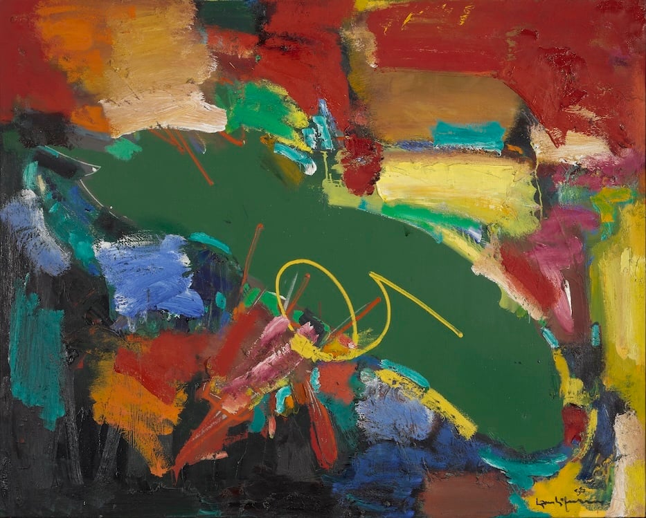
Hans Hofmann, The Pond, 1958. Oil on canvas. Yale University Art Gallery, Gift of Richard Brown Baker, b.A. 1935. Photo: With permission of the Renate, Hans & Maria Hofmann Trust/Artists Rights Society (ARS), New York.
The following comes from the Arts Paper's collaboration with students in ARHS-3375-01W, Art Theory and Criticism at the University of New Haven, where they are working with artist, writer, art historian and educator Jacquelyn Gleisner. Sarah Almasri is a senior at UNH majoring in interior design with a concentration in pre-architecture.
Walking into the Hans Hofmann exhibition at the Yale University Art Gallery, the first thing I noticed was how alive everything felt.
Even though the paintings are abstract, they are still full of movement and emotion. In several of them, bright rectangular blocks of color float on top of darker backgrounds, creating the illusion that some shapes are moving forward while others recede backward into space. The tension between warm colors, like reds and oranges, and cooler ones, like blues and greens, give the flat canvas additional depth. Many of the canvases are large and hung with enough space between them, such that each feels like its own moment.
Those moments come together in Hans Hofmann, running at the Yale University Art Gallery (YUAG) through June 28. Throughout, YUAG Curatorial Projects Manager Michèle Wije gives a viewer plenty of chances to slow down and look closely, inviting them to focus on the intensity of the colors and the skill of the artist without distraction.
In Hofmann’s 1958 painting The Pond, for instance, the canvas is fairly large, making thick areas of bright green, deep blue, and flashes of orange and yellow feel immersive rather than delicate. Some sections of the paint appear layered and textured, almost as if Hofmann applied them quickly and confidently with a loaded brush. They don’t blend smoothly, but collide at the edges, creating sharp contrasts that make certain areas jump forward while others recede.
Even though it doesn’t literally depict a pond, the shifting greens and reflective blues are evocative of light moving across water. The painting feels active and almost physical, as if the surface is vibrating.

Hans Hofmann, Provincetown, 1942. Black ink. Yale University Art Gallery, Richard Brown Baker, b.A. 1935, Collection. Photo: With permission of the Renate, Hans & Maria Hofmann Trust/Artists Rights Society (ARS), New York.
The show, organized by Wije, does a good job of introducing its viewers to Hofmann’s style and ideas, especially if a viewer isn’t already familiar with abstract art. One label, for instance, introduces Hofmann’s concept of “Push/Pull,” a term that he often used in talking about his artwork. The idea comes out of his overlapping, many-hued color planes of color, in which the layering of colors, shapes, and textures “create a sense of advancement and recession,” according to text in the gallery.
The effect is a show that, instead of feeling confusing or intimidating (as abstract art can sometimes be), encourages a viewer to slow down and look. At first, I walked through quickly, but I kept getting pulled back to certain paintings, especially the bright blocks of color, and ultimately took time with many of the works.
Throughout, Hofmann’s use of color stood out to me. His paintings are full of bold, saturated hues that push toward and pull away from each other, just as his theory suggests. Seeing this concept explained in the gallery, and then actually spotting it in the paintings, made the act of viewing much more interesting, because it felt like I was learning how to see the artwork rather than just glancing at it.
The exhibition also shows Hofmann not just as an artist, but also as a teacher (including one work by the artist Lee Krasner, who was his student). Some works demonstrate the same ideas he taught his students, focused on color relationships and spatial tension. Knowing that he influenced so many other artists adds another layer of meaning to the show. It makes you realize that his impact on modern art wasn’t only through his own paintings, but also through the generations of artists that he helped shape.
The layout of the exhibition also helps viewers understand the work without feeling overwhelmed. The wall texts are clear and helpful, but they don’t over-explain or use overly technical language. I appreciated that balance, because it allowed me to form my own opinions while still giving me enough context to understand what I was looking at. Sometimes museum labels can feel too academic, but here they actually made the experience more engaging.
Overall, I thought this exhibition was really successful. It made abstract art feel accessible and exciting rather than distant or confusing. Even if someone doesn’t usually like abstract painting, this show might change their mind; it demonstrates how expressive and thoughtful it can be. By the time I left, I felt like I understood Hofmann’s work more clearly and appreciated how much intention goes into something that might initially look random.
It’s the kind of exhibition that stays with you afterward. I was thinking differently about how color can create movement, tension, and meaning on a flat surface. In that way, the exhibition does more than just display art; it reshapes the way we see it.