


Books | Design | Kehler Liddell Gallery | Arts & Culture | Visual Arts
| Lucy Gellman Photos. All art pictured is by George Corsillo. |
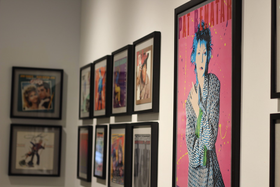
On one end of Kehler Liddell Gallery, musician Pat Benatar is looking straight out at the viewer. Her name floats above her head in thick, stenciled letters, so punchy they might have been colored in with someone’s sticky red and mauve lipstick. Paint splatters surround her body in yellow and purple. She’s been Warholized: spiky hair in black and neon blue, eyes accented with vivid pink, mouth turned to a sultry, slanted pink-and-blue line.
Or maybe she’s been Corsillo-ized, by an artist who has defined pop culture while working for decades behind the scenes.
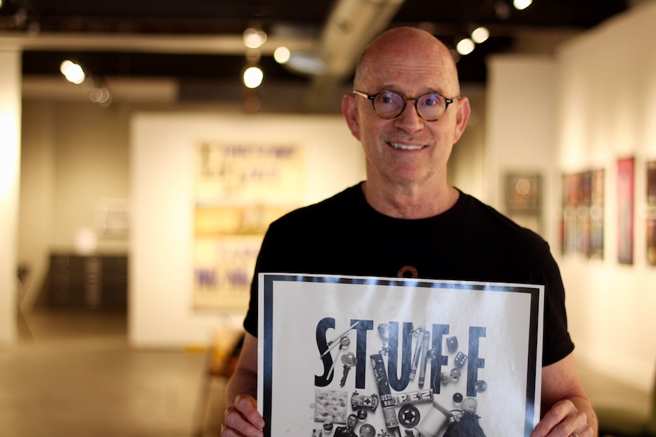
The piece is part of More Is More, a sweeping and delicious look at the work of graphic designer and Westvillian George Corsillo, now one half of Design Monsters with the multimedia artist and his wife Susan McCaslin. After opening July 5, the show runs through Aug. 18. An opening reception and artist’s talk is planned for July 13 from 3 to 6 p.m.; more information is available at the gallery’s website.
“More Is More has a lot to do with … well, I want all of it,” he said in a recent interview at the gallery, motioning to the book jackets and album covers that have built decades of his career. “You’ve got Mies van der Rohe—those clean lines, very minimal—that’s less is more. This is the opposite.”
For Corsillo, that aesthetic comes from a long and still-evolving career in graphic design, with a particularly distinguished record in album covers, book jackets and poster art. Born and raised in Hartford, the artist got his first taste of artmaking as a kid, taking art classes at the Wadsworth Atheneum during his elementary school years.
By the time he was a high school student at Northwest Catholic, he was painting murals for the school dances, staying so late to finish that he often was the last to leave the school. He recalled designing one for a winter dance, with bundled-up Eskimos spearing seals in the Arctic. On one part of the wall, red paint spurted everywhere in place of blood.
“I loved drawing, and I loved doing art,” he said. “So I sort of knew.”
When his classmates applied to top tier colleges and universities, Corsillo followed suit. But even then, he said, "I knew that I didn't want to study Latin," or become a doctor or lawyer. Instead, he headed for the Pratt Institute in New York, where he met McCaslin. First he was shocked by how different it was from the little art world he had known in Hartford. Then he was hooked.
“It was good, because I was this prepper, this kid from the Northeast, and it was the 60s,” he said. “I needed my world really shaken up. It was the best thing that ever happened to me.”
When Corsillo graduated in 1972, he stayed in the city to work for Warner Paperback Library, under designer and art director Harris Lewine. Book design was still 18 years away from the release of Adobe Photoshop, which meant that Corsillo’s job was largely mechanical—doing the physical cutting and paste-up jobs for the art that got translated into book jackets. Lewine, who died in 2016, was a tough boss, but a good one—“sort of infamous and wonderful” at the same time, Corsillo said. The artist learned on the job, meeting iconic American designers like Milton Glaser along the way.
Then one year into the job, Warner Paperback went through a merger—the first of several before the end of the twentieth century—and everyone except Corsillo was laid off. Corsillo went to Lewine in a panic, explaining that he didn’t want to work there with the new staff. He was, by his own recollection, “really a nervous wreck.”
No sweat, Lewine reassured him. It was all figured out. He had set up a job for Corsillo with the designer Paul Bacon, an artist known for creating the ”Big Book Look” who went down as one of the most influential designers in the twentieth century. Corsillo, still in his early 20s, could list off some of his covers in his sleep—Catch-22, Ragtime, One Flew Over The Cuckoo’s Nest among thousands of others. He approached the job like a sponge.
“I learned all that I needed to learn from him,” Corsillo said.
In 1977, Corsillo and McCaslin packed up a car and drove across the country to Los Angeles. Within two weeks, he had found a job with the design firm Gribbitt!, soon working on album covers and billboards for the city’s iconic Sunset Strip. It was a funny kind of ballet, he recalled—designers would present their vision on a board that was no more than 20 inches, for a billboard that was 40 feet across.
At Gribbitt!, Corsillo became a designer that record labels wanted to work with, churning out covers for Casablanca Records, Cher, Kiss and the Village People among others. After working on the album design for the major motion picture Grease, he recalled proposing a number of “crazy” design elements for the billboard that seemed like they would be fun.
“Like, can the car be separate and rock back and forth? Can we have smoke coming out of the tailpipe? Can there be neon around the album cover?” he recalled asking. Weeks later, when he and a friend got stuck in a traffic jam on the Sunset Strip, he saw that everything he asked for was there.
A sort of pronounced, signature style—or many—started growing out of his images. He worked on the invites for Cher’s roller disco parties, all held at a roller rink called Flipper’s. He dreamed up the front, back and inside covers for Dolly Parton’s 9 to 5 and Odd Jobs, which involved stopping a photo shoot long enough to find a pair of fluffy pink high-heeled Marabou slippers that worked for the album’s back cover. He engineered tilting her forward during the shoot, and surrounding her with a barrage of appliances, from a typewriter to paint roller.
Still short of his 30s, Corsillo was in-demand, nimble and gutsy. He responded to a burgeoning punk scene in L.A., doing experiments with ripped paper, paint splatters and black dymo tape that ultimately drew the attention of New Wave band Bugs Tomorrow, for which he designed an album cover.
Then Newsweek called. They wanted him to design a cover on “Rock’s New Wave.” The week it was supposed to run, the Iran Hostage Crisis ended. The original cover design, never published, sits on the wall of the gallery, still radiating a certain chopped, punchy energy.
For Corsillo, it marked a moment that defined the next decades of his work. In 1981, he and McCaslin moved back to New York, for him to run a satellite office of Gribbitt! while their family grew from three to five out of a house in Darien. When the satellite office fell through a year later, he launched his own firm, aptly titled George Corsillo Design.
“I was a freelancer in the real sense of the word,” he joked. "And I got so lucky."
He was also well-known enough that he made it work, quietly leaving a watermark on design history. Sometimes, record companies reached out with the images from a photo session that they’d already finished, and saw what he could come with. Several of those now wink out in the exhibition, including album covers for the Velvet Underground and artist Tom Jones, who looks like he is ready to get on a horse and ride into town.
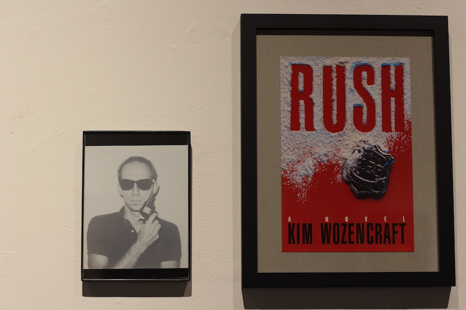
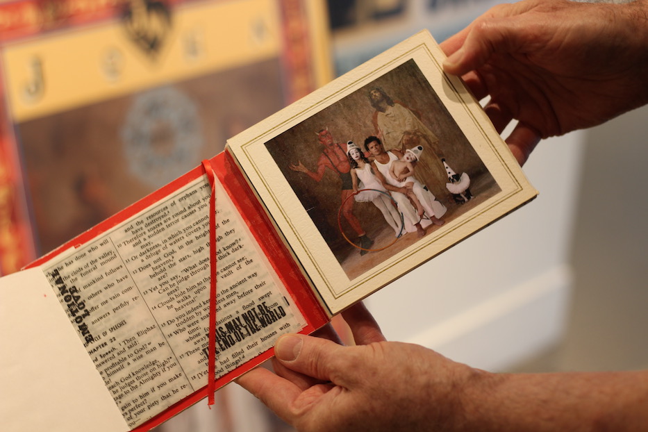
He entered what he called a “murder and mayhem” phase, in which he designed book jackets that didn’t come with photos, on which he would remix a “Big Book Look” sensibility and photos of himself or family members that he’d taken when no photo was available. That included his kids, to whom he would pay $25 or $50—”you know, a model fee!”—to make a design finally fall into place.
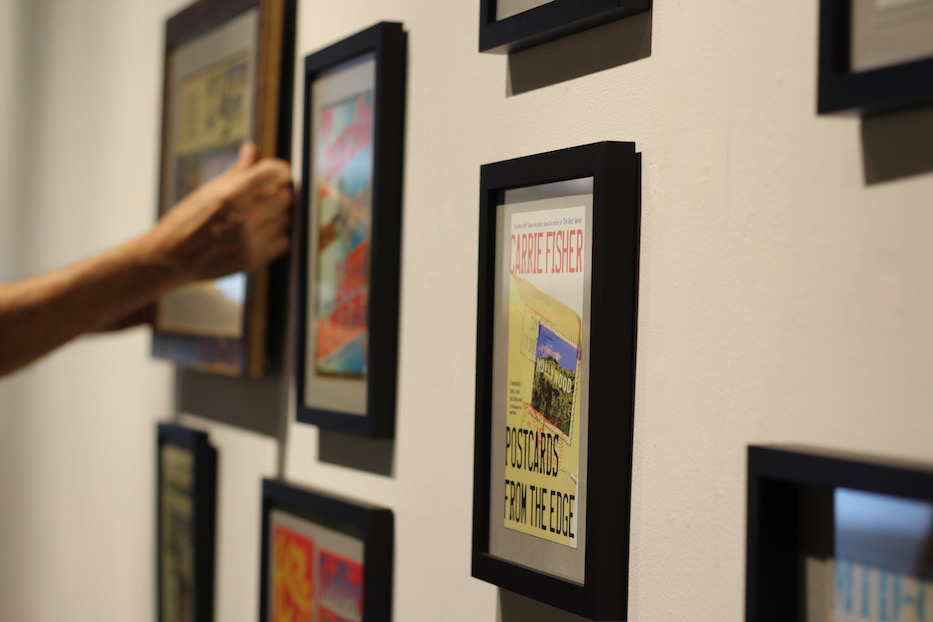
In the mid-1980s, he met Frank Metz, art director at Simon & Schuster. He churned out book jackets, the covers often very different in design. There was Bret Easton Ellis’ cover for Less Than Zero, mixing references from the book with his interest in pop and New Wave. It launched him on to other designs for Ellis, as well as Delacorta’s (the author Daniel Odier) Diva and Nana.
In the 2005 text By Its Cover: Modern American Book Design, authors Ned Drew and Paul Sternberge pinpoint the Delacorta covers as transformative, describing Corsillo as using “roots in both punk graphics and the postmodern theory that would help shape the understanding of graphic design in the 1980’s.”
“You’re inventing a new style,” Metz told him at the time.
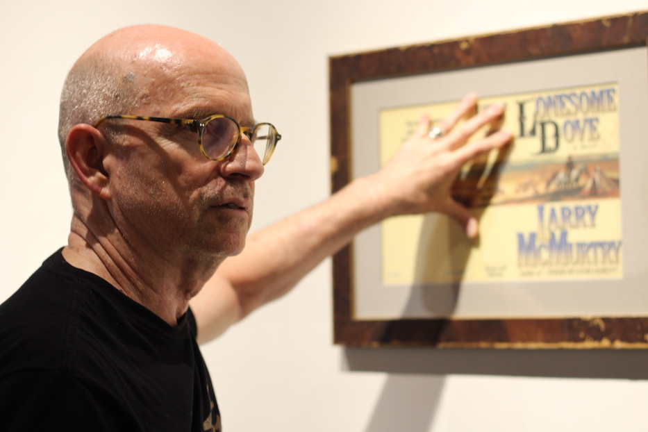
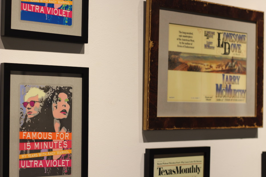
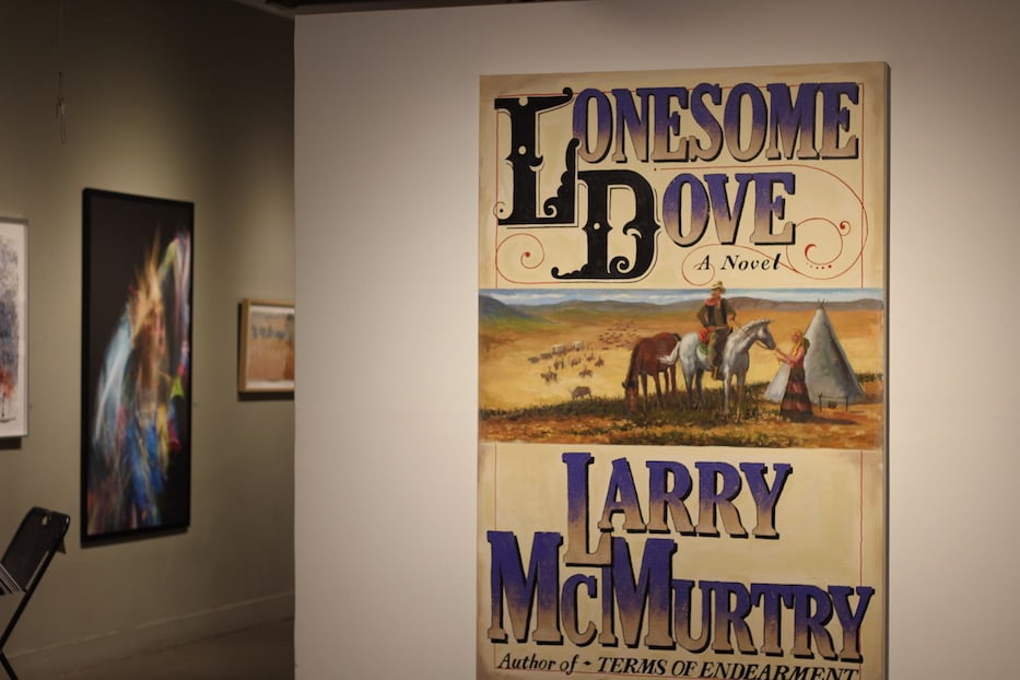
But it was a new style that made room for old references. Tipped off by a fellow designer that Larry McMurtry’s new book was going to be “really a big deal,” he scored work on Lonesome Dove, which went on to win the Pulitzer Prize for nonfiction in 1986.
Corsillo, still commuting between Connecticut and New York almost every day, recalled reading the 800-page manuscript on the train and crying. As he worked on the design, he looked back into scenes of the old West and old Westerns that tried to capture it, pulling big, loping script and expansive, panoramic views of the next frontier from those sources.
In the finished cover, of which there is both an original wrap-around jacket and huge canvas on view, it’s possible to tease out those references. One look might yield a reminder of George Catlin’s sketchbooks of the American West; another Howard Hawks’ 1948 Red River; another the original images that plastered Zane Grey novels.
Like so many pieces in the show, it’s also a testament to how Corsillo’s work has transformed American book design, album art and cinematography more broadly—Lonesome Dove’s imagery echoes in Quentin Tarintino and Coen Brothers posters; it whispers from wrap-around book jackets to Steve Cooley’s new covers of A. B. Guthrie’s novels to far beyond.
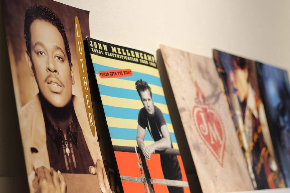
Corsillo credits that cover for decades of work that followed, he said. In the exhibition, viewers can watch that trajectory bloom across the walls: from the book Lonesome Dove came the whole catalogue of McMurtry’s work, then a call from John Mellencamp’s manager, then a week in Indiana with Mellencamp and Pulitzer Prize-winning photographer Skeeter Hagler, who is known for his photographs of cowboys.
In the first cover he designed with Hagler—Mellencamp’s 1987 The Lonesome Jubilee—the musician sits at a bar, elbows on the wood, eyes looking away from the camera. Its’ rustbelt Americana 101: a guy who looks like he’s been in a factory all day (and probably has) blends into the background behind the musician. Mellencamp himself isn’t paying attention, a white shirt straining just a little against his arms and back.
Big text cuts in on a yellow background, announcing the album with clean, geometric lines in a world that looks soaked in cheap beer and motor oil. Mellencamp is grittier and more beautiful than he perhaps ever has, or ever will again.
Corsillo worked with Mellencamp for years, delicately arranging celebrated covers including Mr. Happy Go Lucky (1996) among others. He was a hot commodity: his work for Mellencamp led him to design album artwork for Pat Benatar and Luther Vandross. Corsillo recalled his nerves each time he waited to hear back about a design that seemed too bold or different, and the relief that would wash over him every time he got positive feedback.
“The best work I’ve done is for art directors who totally trust me,” he said. “I do my best work when I can play and dream.”
The show, in some ways, is one big timeline of those dreams brought to life. As the works wink out, so do their stories. There are the ones that New Haveners may know already, like Corsillo’s longtime collaboration with Doonesbury author Garry Trudeau, including a limited-edition collaboration with Starbucks and hundreds of illustrated strips he plans to talk more about later this month.
But also, some that Corsillo has kept closer to the vest. There were, for instance, the photo shoots where Pat Benatar had to find a way to strategically hide the fact that she was pregnant, including one such cover that Corsillo colored so fantastically by hand it resembles early twentieth century French film. Or one where Mellencamp had switched out one kid for another in his pose for Mr. Happy Go Lucky, and finally gotten the cover image he wanted.
Or the edgy, cut-and-pasted geometric shapes that come together in a Vandross cover where the artist had been self-conscious about a recent weight gain, and hoped that Corsillo and the photographer couple known as Guzman could find a way to make him look skinnier. In the image, which accompanied his 1998 I Know, he looks out with melty eyes, a sweatshirt covering the outline of his face.
“We always figured out ways,” Corsillo said.
Those ways ultimately led him to New Haven. Eight years ago, he and McCaslin moved to Westville after visiting the city for years. The two were drawn, almost instantly, to how tightly knit and supportive the city’s art community seemed. Through Mike Morand, they met Will Baker, then the director of the Institute Library on Chapel Street.
Not long after the two had become members, Corsillo was designing pro-bono posters for library events, including its signature “Book Plates” fundraiser, hog roasts, and monthly “Amateur Hour” sessions. That local design bug spread: to signage for Lotta Studio just across the street from his home, to East Rock Brewery, where Design Monsters designed the taps, mural, truck decals, labelling, growlers and swag, to Cafe X and limited-edition celebrations for Día de los Muertos and turns of phrase by which he is tickled, including “a murder of crows.”
It’s a sort of warm thank you to the city, that doubles as a quiet reference to the very personal impact he has left on New Haven. And it appears to be one that goes both ways. This space—not Hartford, not L.A., not New York—seems so clearly to echo of home.
“That’s what this room is about,” he said. “I can’t imagine a more supportive community.”
More Is More runs at Kehler Liddell Gallery through Aug. 18, with several artist talks in between. For gallery hours, events and more information, visit the gallery online.